You choose paint colors for your home by starting with the room’s purpose and natural lighting, then selecting a dominant neutral for the walls, a secondary color for accents, and a pop of color for small details. The 60-30-10 rule, recommended by professional interior designers, divides your color scheme into 60% dominant, 30% secondary, and 10% accent, creating a balanced, cohesive look in every room. According to HomeLight, painting a median-priced home can boost its value by roughly $12,130, so picking the right colors is both a design decision and a financial one. This guide walks homeowners in Lexington, SC, and the Columbia area through every step of choosing colors that look beautiful, feel right, and stand the test of time.
What Is the 60-30-10 Rule for Painting?
The 60-30-10 rule for painting is a design formula that divides a room’s color scheme into three parts: 60% dominant color, 30% secondary color, and 10% accent color. According to Homes and Gardens, the dominant color covers the largest surfaces like walls and ceilings, the secondary color appears on furniture, curtains, and smaller surfaces, and the accent color shows up in pillows, artwork, and decorative details. This ratio creates visual balance and prevents any single color from overwhelming the space.
According to Diamond Vogel, using equal amounts of each color actually creates a more unbalanced, spotty look. The 60-30-10 proportion feels intentional and polished because it gives the eye a clear visual hierarchy. The dominant color establishes the mood, the secondary color adds depth, and the accent color provides the personality.
For homeowners in Lexington, a practical example might look like this: warm white walls and ceiling (60%), sage green upholstered sofa and curtains (30%), and brass hardware with terracotta throw pillows (10%). This combination feels grounded, modern, and warm without being overwhelming. The 60-30-10 rule works with any style, from traditional Southern homes in Red Bank to modern builds around Lake Murray.
If you want to go bolder, the ratio still works. Try a soft greige on walls (60%), deep navy on an accent wall and bookshelves (30%), and gold or mustard accents (10%). The formula keeps even bold color choices looking polished. Professional interior painting teams can help translate this formula into a specific paint plan for your home.
What Paint Colors Are Trending Right Now?
The paint colors trending right now are warm whites, earthy neutrals like greige and mushroom, muted greens like sage and eucalyptus, warm browns and clay tones, and moody deep shades like charcoal and navy. According to the Fixr 2026 Interior Design and Color Trends Report, nature-inspired neutrals and deep browns are expected to dominate interior design this year.
Cool grays are officially on their way out. According to Camille Styles, designers are shifting to warmer tones like mushroom taupe, soft stone, and warm-toned beige. Erica Yaw, Lead Designer at Rumor Designs, recommends warm greige for its calming, grounding qualities. These colors feel fresh and welcoming without the cold feeling that defined the “millennial gray” era of the 2010s.
Green continues to be one of the most popular color families. Sage, olive, eucalyptus, and dusty mint bring a sense of nature and calm into any room. According to Paint Corps, muted greens are especially popular with homeowners looking for a wellness-oriented home environment. They pair well with trending materials like rattan, white oak, brass fixtures, and soft linens.
For homeowners in the Columbia metro area, warm whites and greige tones are the safest and most versatile choices for whole-house color. These neutrals photograph well for listings, appeal to the widest range of buyers, and work beautifully with South Carolina’s warm natural light. Bolder trend colors like sage green or charcoal work best as accent walls or in smaller spaces like powder rooms and home offices.
What Color Makes a House Look Expensive?
The colors that make a house look expensive are warm whites, soft greige, muted blue-gray, charcoal accents, and earthy neutrals like taupe and mushroom. These colors feel sophisticated and intentional without trying too hard. According to a Zillow Paint Color Analysis that studied over 32,000 listing photos, specific paint colors directly affect buyer perception and sale price.
White and off-white interiors remain the gold standard for expensive-looking homes. Shades like Sherwin-Williams Alabaster and Benjamin Moore White Dove make rooms feel bright, airy, and well-maintained. Paired with crisp white trim and warm wood tones, these colors create the “quiet luxury” aesthetic that dominates high-end design right now.
According to Angi, interior painting delivers an average return on investment of 107%. Homes painted in fresh, neutral colors sell faster and for higher prices than homes with bold, dated, or overly personal color choices. HomeLight reports that painting a median-priced home can boost value by roughly $12,130, making color selection both an aesthetic and financial decision.
For homes in Lexington and the Lake Murray area, warm white walls with slightly darker trim accents create an elevated, custom look. Dark charcoal or navy front doors add a modern, high-contrast touch that stands out in any neighborhood. These combinations photograph beautifully and signal quality to buyers before they even step inside.
What Paint Colors Are Outdated?
The paint colors that are outdated are cool gray, builder-grade beige, stark bright white, Tuscan gold, and bold red accent walls. These colors were trendy in specific eras but now make homes feel dated when buyers or guests walk through the door.
Cool gray dominated interiors from roughly 2012 to 2020. According to Kylie M Interiors, while many homeowners still live with gray walls, the trend has shifted decisively toward warmer tones. Walls painted in cool blue-grays like Sherwin-Williams Repose Gray or Benjamin Moore Stonington Gray now read as “last decade” to design-savvy buyers.
Builder-grade beige and Tuscan gold are leftover from the early 2000s Mediterranean trend. These yellow-heavy neutrals feel heavy and outdated compared to today’s softer, cooler-undertoned warm neutrals like greige and mushroom. According to HomeLight, real estate agents consistently recommend neutral colors for sellers, but today’s neutrals are lighter and more refined than the beiges of 20 years ago.
Stark, pure white with no undertone can also feel dated and clinical. According to Pantone’s 2026 Color of the Year commentary, the shift is toward foggy, muted off-whites with visible nuance rather than the harsh, bright white walls that defined minimalist trends in the mid-2010s. The new approach to white includes warmth and softness.
Homeowners in the Red Bank and Gilbert communities who still have cool gray or Tuscan beige walls can update the look with a single residential painting project. Switching to a warm white or soft greige instantly modernizes the space.
What Color Is Replacing Gray?
The colors replacing gray are warm greige, mushroom taupe, soft beige, and earthy warm neutrals. According to Camille Styles, designers have moved past cool grays toward tones that feel organic and grounding. Daniele Doerge, a color expert from California Paints, confirms that mushroom taupe, soft stone, and warm-toned beige are the new go-to neutrals replacing cool gray in homes across the country.
Greige, a blend of gray and beige, sits right at the crossover point. It keeps the sophistication that made gray popular while adding warmth that cool grays lacked. According to Roe Painting, popular greige options like Sherwin-Williams Accessible Beige and Benjamin Moore Pale Oak are among the most requested colors by homeowners planning a repaint.
For homes in the Lexington area that currently have cool gray walls, transitioning to a warm greige or soft off-white is a smart update. Sherwin-Williams White Duck and Shoji White are popular bridge colors that help homes transition from the gray trend to the warmer palette without a jarring change. These colors look especially beautiful in South Carolina’s warm natural light.
Which Color Is Best for a Full House?
The best color for a full house is a warm white or light neutral that flows seamlessly from room to room. Using one cohesive wall color throughout the main living areas creates a sense of openness, continuity, and spaciousness. According to multiple interior design sources, the most popular whole-house colors right now are Sherwin-Williams Alabaster, Benjamin Moore White Dove, Sherwin-Williams Shoji White, and Benjamin Moore Pale Oak.
These colors work in every room because they adapt to different lighting conditions. A warm white looks bright and clean in a sun-filled living room, soft and cozy in a bedroom with less natural light, and fresh and functional in a bathroom. This versatility eliminates the stress of choosing a different color for every room and prevents the choppy, disjointed feel that happens when too many colors meet in hallways and open floor plans.
According to Kylie M Interiors, the shift toward using one color on walls, trim, doors, and ceilings for a seamless, tonal look is one of the strongest trends heading into 2026. This “color drenching” technique in soft neutrals creates a sophisticated, designer feel without any bold risk.
For homeowners in Lexington planning a whole-house repaint, choosing one warm neutral and applying it throughout the home is the fastest, most affordable, and most impactful approach. Use variations of that same tone on trim (slightly lighter or darker) to add depth without introducing competing colors. A full house painting project with a single cohesive color looks polished and professional.
How Many Colors Should a Living Room Have?
A living room should have 3 to 5 colors total, including the wall color, trim, furniture tones, and accent pieces. According to the 60-30-10 rule, three colors is the ideal starting point for a balanced, cohesive look. Going beyond five colors risks making the room feel chaotic and cluttered instead of intentional and designed.
According to Sara Lynn Brennan, an interior designer, the simplest approach is to choose one dominant color for the walls (60%), one secondary color for large furnishings and textiles (30%), and one accent color for decorative touches (10%). You can add a fourth or fifth color through smaller details like throw pillows, vases, or artwork without upsetting the balance.
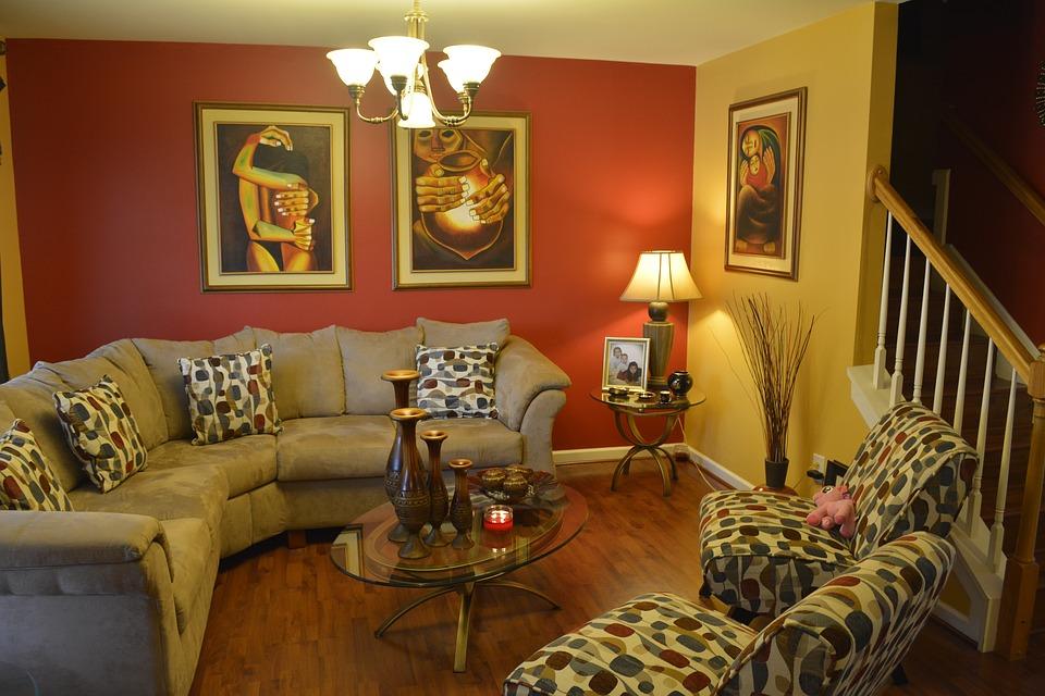
For living rooms in the Lexington and Columbia area, a popular 3-color scheme is warm white walls, a warm wood or taupe sofa and rug (secondary), and sage green or navy accents through pillows and art (accent). This combination feels modern, livable, and connected to the natural landscape of central South Carolina.
If you want more color in your living room, use the 60-30-10 framework but add a second accent color in the remaining details. This looks like 60-30-5-5, which keeps the room grounded while allowing more personality. The key is keeping the dominant and secondary colors relatively neutral so the accent colors can shine without competing.
What Are the 7 Rules of Interior Design?
The 7 rules of interior design are balance, rhythm, emphasis, proportion, harmony, contrast, and unity. These principles guide professional designers in creating rooms that feel complete, comfortable, and visually appealing. When choosing paint colors, several of these rules directly apply.
Balance means distributing visual weight evenly across the room. A dark accent wall on one side of a room should be balanced by a large piece of furniture or artwork on the opposite side. Rhythm refers to creating visual flow through repeating colors, patterns, or textures. Using the same accent color in two or three places around the room creates rhythm that moves the eye naturally through the space.
Emphasis creates a focal point. Paint can establish emphasis through an accent wall, a painted fireplace surround, or a boldly colored built-in. Proportion and scale relate to how elements relate to each other and to the room’s size. In small rooms, lighter colors feel more proportional because they make the space feel larger.
Harmony and unity tie everything together. Using colors from the same family or with similar undertones creates harmony. A room where the wall color, trim, and furnishings all share warm undertones feels unified and intentional. Contrast adds visual interest, like pairing light walls with dark trim or a bold-colored door against a neutral hallway.
Understanding these principles helps homeowners in Lexington make confident color decisions. Even if you are not a designer, following these basic rules leads to rooms that feel “right” without being able to pinpoint exactly why. For rooms that also need wall prep before painting, drywall repair and painting services handle both structure and color in one project.
What Is the 80-20 Color Rule?
The 80-20 color rule is a simplified version of the 60-30-10 rule that divides a room’s color scheme into 80% neutral tones and 20% color. This approach is ideal for homeowners who want a calm, neutral base with just enough color to keep the room from feeling bland. It is the safest formula for resale-focused painting and works well in open-concept homes where many rooms flow into each other.
The 80% neutral portion includes the walls, ceiling, large furniture, and flooring. This is your warm white, greige, or soft beige. The 20% color portion covers accent pillows, art, smaller furniture pieces, rugs, and decorative objects. This ratio keeps the room feeling open and spacious while still showing personality.
According to interior design experts, the 80-20 rule is especially effective in smaller homes and apartments where too much color can make rooms feel cramped. Homes throughout the Lexington area with open floor plans benefit from this approach because the consistent neutral base creates visual continuity from room to room, while the 20% color can change in each space to give individual rooms their own identity.
What Two Colors Go Together for a Living Room?
The two colors that go together best for a living room are warm white and sage green, greige and navy, soft beige and charcoal, or cream and dusty blue. These combinations pair a neutral base with a richer secondary tone that adds depth and visual interest without feeling overwhelming.
According to the 2026 color trend reports from Sherwin-Williams, Benjamin Moore, and multiple design publications, the strongest two-color pairings right now all share one trait: a warm neutral paired with a nature-inspired color. The warm neutral grounds the room, while the natural tone adds character and mood.
For living rooms in the Columbia area, warm white walls with sage green accents is a standout combination. It feels fresh, connected to nature, and works beautifully with the warm wood tones, brass fixtures, and linen textures that are trending in furniture and decor. Another strong choice is soft greige walls with muted navy furniture, which creates a classic, timeless look that suits both traditional and modern homes.
Avoid pairing two strong, saturated colors as your primary combination. A room with bright red walls and deep teal furniture fights for attention and makes the space feel tense. Let one color be quiet and the other be interesting, and the room will feel balanced and inviting.
What Is the Color Trend in the Living Room in 2026?
The color trend in the living room in 2026 is warm, earthy tones that create a calm, grounding atmosphere. According to Homes and Gardens, designers are using soft warm whites, muddy greens, teal blue-greens, clay and terracotta accents, and warm charcoal to build living room palettes that feel organic and intentional.
According to Camille Styles, the 2026 palette is deeply connected to nature and the outdoors. Colors like clay, putty, soft terracotta, and warm charcoal feel grounding because people already associate them with the natural world. Daniele Doerge from California Paints notes that these earth-inspired tones create warmth and serenity while still encouraging homeowners who want to move beyond plain white or beige.
Color drenching is one of the boldest 2026 living room trends. This technique involves painting walls, trim, ceiling, and even doors the same color for an immersive, cocooning effect. According to Rocky Mountain Hardware, deep browns, warm greens, and muted teals are popular choices for this approach. It works especially well in living rooms where you want to create a dramatic, intimate atmosphere.
Homeowners across Lexington who are updating their living rooms this year have plenty of options, from the safety of warm white to the boldness of color drenching in a rich green. The key is choosing a tone that works with your home’s natural light, existing flooring, and the mood you want the room to convey. Pairing an updated living room with a refreshed porch extends the updated feel to your outdoor living space too.
What Paint Colors Are Timeless?
The paint colors that are timeless are warm white, soft greige, navy blue, sage green, and classic black (for accents). These colors have remained popular across multiple decades because they work with any design style, adapt to changing trends through accessories, and never look dated.
According to Roe Painting, warm whites like Sherwin-Williams Alabaster and greige tones like Benjamin Moore Pale Oak are among the safest choices for timeless interiors. They have proven staying power through multiple trend cycles and complement any furniture style from mid-century modern to traditional Southern.
Navy blue is a timeless accent color that works on front doors, accent walls, bookshelves, and kitchen islands. It pairs with warm whites, brass hardware, and warm wood tones for a classic combination that has been popular for decades and shows no sign of fading. Sage green occupies a similar space as a nature-inspired accent that feels current but rooted in a long design tradition.
Black accents on trim, window frames, light fixtures, or a front door add a modern, high-contrast element that has been a design staple for centuries. According to House Digest, charcoal and near-black shades with brown, blue, or green undertones offer more dimension than pure black while still providing that timeless, grounding contrast.
For homeowners in Lexington who want colors they will love for 10 or more years, sticking with warm whites on walls and navy or sage as accent colors is a formula that works beautifully and never goes out of style. These are the same colors that look equally at home in a historic Columbia bungalow or a new build in Gilbert.
Best Paint Colors by Room
| Room | Best Color Family | Popular Specific Shades | Why It Works |
|---|---|---|---|
| Living Room | Warm white, greige | SW Alabaster, BM White Dove, BM Pale Oak | Versatile, photographs well, adapts to any decor |
| Kitchen | White, soft green | SW Pure White, BM Chantilly Lace, SW Evergreen Fog | Clean, bright, pairs with all cabinet colors |
| Bedroom | Soft blue, sage, warm neutral | SW Passive, BM Palladian Blue, SW Accessible Beige | Calming, restful, promotes relaxation |
| Bathroom | White, light blue, soft green | SW Extra White, BM Woodlawn Blue, SW Sea Salt | Clean feel, pairs with tile, resists visual humidity |
| Home Office | Greige, muted green | SW Worldly Gray, BM Sage Wisdom, SW Intellectual Gray | Focused yet calming, reduces eye strain |
| Entryway | Warm white, bold accent door | BM Simply White + SW Naval door | Bright and welcoming, strong first impression |
| Dining Room | Warm neutral, moody accent | BM Silhouette, SW Universal Khaki, deep navy | Intimate, sophisticated, flatters skin tones |
Sources: Sherwin-Williams (2025-2026 color collections), Benjamin Moore (Color of the Year selections), Fixr 2026 Interior Design Report, Kylie M Interiors (popular color recommendations), Camille Styles (2026 trend report)
How Do You Test Paint Colors Before Committing?
You test paint colors before committing by painting large sample swatches directly on your walls, using peel-and-stick paint samples, or buying small sample pots and applying them to poster board that you can move around the room. According to Toulmin Cabinetry, testing is one of the most important steps in choosing paint colors because lighting, furniture, and flooring can dramatically change how a color looks on your wall compared to a small swatch at the store.
Paint a sample area at least 12 inches by 12 inches on the wall you plan to paint. Place it near a window, near the room’s trim, and near your largest piece of furniture. Observe the sample at different times of day: morning, afternoon, and evening under artificial light. Colors shift dramatically as natural light changes throughout the day. A warm beige can look peachy in morning sunlight and almost gray under LED lights at night.
According to Benjamin Moore, peel-and-stick samples are an excellent option because they are easy to apply, move, and remove without leaving marks. These large, adhesive color swatches can be placed in multiple rooms to see how the same color looks under different lighting conditions.
Never choose a paint color based solely on a small chip at the hardware store. The tiny swatch bears almost no resemblance to how the color will look spread across an entire wall. According to Family Handyman, buying two or three sample colors and testing them side by side on your actual wall is the only reliable way to make a confident decision. The $10 to $15 spent on samples saves you from the $50 to $70 wasted on a full gallon of the wrong color.
What Makes a Home Look Outdated?
The things that make a home look outdated are dated paint colors, mismatched finishes, heavy window treatments, brass from the 1990s, popcorn ceilings, and worn or scuffed walls. According to HomeLight, buyers make quick judgments about a home’s age and condition based on color alone. Cool gray walls, Tuscan gold, or bright accent walls instantly signal “past trend” to anyone who follows design.
Beyond paint, a home looks outdated when the colors clash with the existing finishes. Oak cabinets paired with orange-toned walls, or pink granite countertops with mauve walls, date a home to a specific decade. Updating the wall color to a warm neutral that complements (rather than matches) existing finishes is the fastest way to modernize the look without replacing expensive fixtures.
According to Angi, interior painting offers an average ROI of 107%, making it one of the most cost-effective ways to update a home’s appearance. For homeowners in Lexington preparing to sell, a fresh coat of warm white or greige on the walls, paired with crisp white trim, eliminates the “dated” feeling and makes every room feel current, clean, and move-in ready.
Homes that also have outdoor areas in need of updating benefit from a comprehensive approach. Pairing interior updates with exterior painting creates a cohesive, fully refreshed property that commands a higher price and sells faster.
Can I Upload a Picture of My House and Try Paint Colors Online?
Yes, you can upload a picture of your house and try paint colors online using free digital tools from major paint brands. Sherwin-Williams offers a ColorSnap Visualizer that lets you upload a photo of any room and test thousands of colors on your walls digitally. Benjamin Moore offers a similar tool through their Color Portfolio app. Lowe’s also provides a Paint Visualizer through their website.
These tools give you a general idea of how a color will look in your space, but they are not perfect. Digital images cannot fully replicate how paint interacts with your specific lighting, flooring, and furnishings. According to Toulmin Cabinetry, these online tools are a great starting point for narrowing down options, but you should always follow up with physical paint samples on your actual walls before making a final decision.
For the most accurate digital preview, photograph the room during midday with natural light and no overhead lights or lamps on. Upload that photo to the visualizer tool. This gives the most neutral starting point for seeing the true undertone of each color. Compare your top 3 choices digitally, then buy small samples and test them on the real wall to confirm.
What Colors to Avoid with Gray Finishes?
The colors to avoid with gray finishes like gray flooring, gray countertops, or gray cabinets are warm yellows, orange-based beiges, and earthy Tuscan tones. These warm colors clash with cool gray undertones and create a visual disconnect that makes both colors look wrong. According to Kylie M Interiors, one of the biggest mistakes homeowners make is pairing cool gray finishes with warm-toned paint, or vice versa.
If you have cool gray flooring or countertops, stick with cool-toned wall colors: soft blue-grays, cool whites like Benjamin Moore Chantilly Lace, or very light greiges that lean cool. If your gray finishes have warm undertones (some gray floors have brown or taupe tones mixed in), you have more flexibility to use warmer wall colors.
The simplest way to test compatibility is to hold a paint sample against your existing gray finish in natural light. If both feel like they belong together, the undertones match. If one looks “off” next to the other, there is an undertone conflict. Homeowners in the Lexington area with gray LVP flooring (very common in newer construction) should lean toward cool or balanced whites and greiges for the smoothest visual transition.
Which 3 Color Combination Is Best?
The best 3 color combinations for homes right now are warm white + sage green + brass/gold, greige + navy + warm wood, and soft beige + charcoal + cream. Each of these trios follows the 60-30-10 rule naturally and creates a balanced, modern look that feels both trendy and timeless.
Warm white, sage green, and brass is the combination dominating home design in 2025 and 2026. The warm white provides a clean, bright base. Sage green adds a calming, nature-inspired layer. Brass or gold metallic accents provide warmth and a touch of luxury. This combination works in every room from kitchens to bedrooms.
Greige, navy, and warm wood is a more classic combination with strong staying power. Greige walls create a sophisticated neutral backdrop. Navy accents on pillows, art, or a statement piece of furniture add depth. Warm wood tones in furniture, frames, or flooring tie everything together with organic warmth.
Soft beige, charcoal, and cream is ideal for homeowners who love a neutral palette but want more visual interest than all-white. The beige and cream work together as warm, layered neutrals while the charcoal provides contrast and grounding. This combination is especially popular in homes throughout the Red Bank and Gilbert communities where traditional and transitional design styles are common.
If your home also needs outdoor surfaces refreshed, pairing your interior color scheme with coordinated deck, dock, and fence staining creates a unified look from inside to outside.
Frequently Asked Questions
How Do I Choose a Paint Color for My Home in Lexington, SC?
You choose a paint color for your home in Lexington, SC, by considering your home’s natural light, existing flooring and finishes, the room’s purpose, and your personal style. South Carolina homes get abundant warm natural light, which means cool colors look truer and warm colors can feel even warmer than expected. Test samples at different times of day. Start with popular warm whites like Sherwin-Williams Alabaster or Benjamin Moore White Dove as safe, versatile foundations, then add accent colors from there.
What Is the Most Popular Interior Paint Color Right Now?
The most popular interior paint color right now is warm white, with Sherwin-Williams Alabaster and Benjamin Moore White Dove leading the way. According to Kylie M Interiors, Samplize reports, and paint retailer sales data, these warm off-whites are consistently the top-selling interior colors. They work in every room, with every design style, and create a bright, inviting backdrop that adapts to any decor changes you make in the future.
Should I Paint Every Room the Same Color?
Painting every room the same color is a smart choice for open-concept homes and for creating a sense of flow and spaciousness throughout the house. It works best with warm whites and light neutrals that adapt to different lighting in each room. For homes in Lexington with more defined, separate rooms, you can vary the color room by room as long as all colors share the same undertone family. This creates cohesion in hallways where multiple room colors are visible at once.
What Is the Best White Paint for Walls in South Carolina?
The best white paint for walls in South Carolina is a warm white that does not turn yellow or pink in the state’s abundant natural light. Sherwin-Williams Alabaster, Benjamin Moore White Dove, and Sherwin-Williams Shoji White are top choices because they have balanced warm undertones that look beautiful in Southern light without feeling stark or cold. Avoid cool-toned whites in south-facing rooms, as the warm sunlight will fight the cool undertone and make the color look off.
How Do I Pick Colors That Flow from Room to Room?
You pick colors that flow from room to room by choosing shades with the same undertone. If your living room has a warm greige wall, your kitchen should use a white or neutral with warm undertones as well. Avoid mixing cool and warm undertones in adjacent rooms. According to the 60-30-10 rule, your dominant wall color should stay consistent or closely related throughout connected spaces, with room-specific personality added through the 30% and 10% layers of secondary and accent colors.
Does the Direction a Room Faces Affect Paint Color?
Yes, the direction a room faces significantly affects how paint color looks. North-facing rooms in the Columbia area receive cooler, indirect light that can make warm colors look muted and cool colors look harsh. Warm whites and greige tones work best in north-facing spaces. South-facing rooms get abundant warm light that intensifies warm tones and makes cool colors appear truer. East-facing rooms get warm morning light and cooler afternoon light, while west-facing rooms do the opposite. Testing samples at multiple times of day accounts for these lighting shifts.
What Is the 3-5-7 Rule for Decorating?
The 3-5-7 rule for decorating is a design principle that says objects arranged in groups of odd numbers, specifically 3, 5, or 7, are more visually appealing than even-numbered groupings. Odd arrangements create asymmetry and movement that the eye finds naturally interesting. For paint, this rule translates to working with 3 colors per room (following the 60-30-10 ratio), grouping artwork in odd numbers, and using accent colors in 3 or 5 spots throughout the space for a balanced, intentional look.
Final Thoughts
Choosing paint colors for your home does not have to be overwhelming. Start with the 60-30-10 rule to create balanced color schemes. Use warm whites and soft neutrals as your foundation. Add personality through secondary and accent colors that reflect your style. Test every color on your actual walls before committing. Consider your home’s natural light, existing finishes, and the mood you want each room to create. The right colors make your home feel warmer, look more polished, and even increase its market value.
For homeowners in Lexington, SC, and the surrounding communities of Columbia, Red Bank, Gilbert, and Lake Murray, Soda City Painting brings color expertise and professional execution to every project. From a single accent wall to a whole-house transformation, the right color and the right painting team make all the difference.
Ready to bring fresh color to your home? Call (803) 221-0771 or visit the interior painting services page to schedule your free, no-obligation estimate today. The perfect color is waiting, and it starts with one call.